From a Million Listens to a Product Families Pay For

Qabl al Nawm is a 0-to-1 subscription bedtime app for Arabic-speaking families. I led the research and product strategy that turned a rough brief into a defined product, a shared bedtime ritual for a parent and child, then owned the design and brand through launch.

Company

Company

Qabl al Nawm (independent, founder-led)

Qabl al Nawm (founder-led)

Role

Role

Sole Product Designer: research, product, UX, UI, brand, handoff

Sole Product Designer

Team

Team

Founder and development agency

Timeline

Timeline

2 quarters (0-to-1 MVP), Ongoing involvement

2 quarters (0-to-1 MVP)

Context

Qabl al Nawm, which means 'before bedtime' in Arabic, is an original kids' bedtime story podcast told in classical Arabic, with a loyal listenership that has passed a million listens. Its founder wanted to develop an app that would house his content in a proper before-bed experience for children, and turn the trust he had earned from his listeners into subscriptions within that bedtime experience.

The founder approached me in late September 2023. This was a 0 to 1 project with no user data to draw on and a problem space that still needed discovery and definition, to be shipped as an MVP by June 2024, a date the founder set to launch ahead of the summer holidays, when bedtime routines slip and families most want help keeping them.

Challenge

The heart of the problem was a tension inside the product itself. To work as a children's app it had to feel appealing and interesting to a child, and to work as a bedtime app it had to stay calm and settling, never leaving a child alert when the whole point was to wind them down toward sleep. Those two pulls run against each other, and holding them in balance, engaging for a child yet calm for sleep, was the question every later decision had to answer. It also had to work for the parent who shares the moment, since bedtime is as much about a parent and child bonding as about sleep. And beyond that, the experience had to give families enough value that they would choose to pay for it.

Research

The brief was clear on content, audio bedtime stories, lullabies, and sleep sounds behind a subscription, but not on who it was for or how families would use it. So I grounded it in two directions, understanding the founder's own audience and benchmarking the industry.

The brief was clear on content, audio bedtime stories, lullabies, and sleep sounds behind a subscription, but not on who it was for or how families would use it. So I grounded it in two directions, understanding the founder's own audience and benchmarking the industry.

Understanding the users

I surveyed 200 parents of children aged four to eight. The data showed clear patterns:

Understanding the users

I surveyed 200 parents of children aged four to eight. The data showed clear patterns:

Co-listening

children listen with a parent rather than alone (80%).

Device used

usage happens on a phone rather than a tablet (89%).

Established habits

bedtime is already part of a routine (75% listen before bed, 82% already had a routine).

Awareness gap

over a third of parents doubted their kids understood why sleep matters, a conservative signal pointing to a deeper gap around sleep health.

This single finding, that they listen together, defined the product: a shared bedtime ritual on a parent's phone.

Benchmarking the industry

I benchmarked leading players (Aumio, Moshi, BetterSleep, Sleepiest) on content organisation, night-time design, who holds the phone, and paywall approach:

  • Content is structured by type: stories, lullabies, ambient sounds.

  • Night-time screens stay dark and low in blue light and stimulation.

  • Because a parent navigates while a child watches, browsing relies on recognisable visuals rather than dense text.

  • Soft, contextual paywalls woven into browsing reduce churn compared with hard paywalls at launch.

  • Offline listening is a baseline expectation, so a story keeps playing without interruption on a weak connection.

The biggest shortfall was that even dedicated kids' sleep apps carry the brightness and busyness of an ordinary children's app into a product meant to calm. That approach fights the very purpose of the app.

The job to be done: help a tired parent run a calm, low-effort bedtime routine that delights a 4-to-8-year-old without overstimulating them.

I took these findings to the founder as a recommended direction for the product, which framed the decisions we then had to make about what to build.

This single finding, that they listen together, defined the product: a shared bedtime ritual on a parent's phone.

Benchmarking the industry

I benchmarked leading players (Aumio, Moshi, BetterSleep, Sleepiest) on content organisation, night-time design, who holds the phone, and paywall approach:

  • Content is structured by type: stories, lullabies, ambient sounds.

  • Night-time screens stay dark and low in blue light and stimulation.

  • Because a parent navigates while a child watches, browsing relies on recognisable visuals rather than dense text.

  • Soft, contextual paywalls woven into browsing reduce churn compared with hard paywalls at launch.

  • Offline listening is a baseline expectation, so a story keeps playing without interruption on a weak connection.

The biggest shortfall was that even dedicated kids' sleep apps carry the brightness and busyness of an ordinary children's app into a product meant to calm. That approach fights the very purpose of the app.

The job to be done: help a tired parent run a calm, low-effort bedtime routine that delights a 4-to-8-year-old without overstimulating them.

I took these findings to the founder as a recommended direction for the product, which framed the decisions we then had to make about what to build.

Core design principles

From this research I set the guardrails I'd design against:

Don't overstimulate

Where kids' apps add colour, motion, and detail to hold attention, this one strips them back, so it quiets the senses rather than rousing them.

Design for fatigue

Prioritise legibility and effortless navigation for tired parents at the end of the day.

Suggest, don't render

Hint at a story's world rather than fully illustrate it, so a child's imagination does the work as their eyes close.

Design for two, not one

The parent shares the moment, so every decision serves their role, not only the child's.

Shaping the product

The first version had to earn its focus, so the hardest calls were about what to leave out.

Containing the adult section. The founder wanted a section of adult meditations and ambient sounds to give parents direct value. I argued against it, since it risked diluting the calm child experience the product depended on, but he felt strongly it belonged. Rather than lose the point, I contained it behind a two-profile split that kept the child's side clean, a compromise two years of data would later put to the test.

Scoping the voice notes. The founder wanted to carry over a podcast ritual where a child answers a question and replies with a voice note through their parent. Recording a reply pulls toward engagement rather than sleep, and user-submitted audio tied to usernames carried privacy and safety work too heavy for a first release. Working with the developers, we kept the spirit and deferred the risk: a one-way message from the narrator, with a notification when a new one arrives, and a two-way exchange left for later.

Supporting the routine. I added a gentle bedtime reminder notification to prompt parents when it is time to wind down, plus a rotating sleep-health tip to address the awareness gap the survey pointed to. A more complex sleep tracker was scoped, argued for, and deliberately parked for a later release to protect MVP focus.

Setting the architecture. With the scope settled, I mapped the information architecture and the core flows, the plan I brought to the founder and the developers so everyone could see how the app fit together before anything was built. I organised content by type for the first version and flagged that richer, topic-level labelling would be needed as the library grew, though it was out of scope for a small launch library. I checked the plan with the developers early to confirm it was buildable, with offline listening reachable through a favorites tab.

The first version had to earn its focus, so the hardest calls were about what to leave out.

Containing the adult section. The founder wanted a section of adult meditations and ambient sounds to give parents direct value. I argued against it, since it risked diluting the calm child experience the product depended on, but he felt strongly it belonged. Rather than lose the point, I contained it behind a two-profile split that kept the child's side clean, a compromise two years of data would later put to the test.

Scoping the voice notes. The founder wanted to carry over a podcast ritual where a child answers a question and replies with a voice note through their parent. Recording a reply pulls toward engagement rather than sleep, and user-submitted audio tied to usernames carried privacy and safety work too heavy for a first release. Working with the developers, we kept the spirit and deferred the risk: a one-way message from the narrator, with a notification when a new one arrives, and a two-way exchange left for later.

Supporting the routine. I added a gentle bedtime reminder notification to prompt parents when it is time to wind down, plus a rotating sleep-health tip to address the awareness gap the survey pointed to. A more complex sleep tracker was scoped, argued for, and deliberately parked for a later release to protect MVP focus.

Setting the architecture. With the scope settled, I mapped the information architecture and the core flows, the plan I brought to the founder and the developers so everyone could see how the app fit together before anything was built. I organised content by type for the first version and flagged that richer, topic-level labelling would be needed as the library grew, though it was out of scope for a small launch library. I checked the plan with the developers early to confirm it was buildable, with offline listening reachable through a favorites tab.

The first version had to earn its focus, so the hardest calls were about what to leave out.

Containing the adult section. The founder wanted a section of adult meditations and ambient sounds to give parents direct value. I argued against it, since it risked diluting the calm child experience the product depended on, but he felt strongly it belonged. Rather than lose the point, I contained it behind a two-profile split that kept the child's side clean, a compromise two years of data would later put to the test.

Scoping the voice notes. The founder wanted to carry over a podcast ritual where a child answers a question and replies with a voice note through their parent. Recording a reply pulls toward engagement rather than sleep, and user-submitted audio tied to usernames carried privacy and safety work too heavy for a first release. Working with the developers, we kept the spirit and deferred the risk: a one-way message from the narrator, with a notification when a new one arrives, and a two-way exchange left for later.

Supporting the routine. I added a gentle bedtime reminder notification to prompt parents when it is time to wind down, plus a rotating sleep-health tip to address the awareness gap the survey pointed to. A more complex sleep tracker was scoped, argued for, and deliberately parked for a later release to protect MVP focus.

Setting the architecture. With the scope settled, I mapped the information architecture and the core flows, the plan I brought to the founder and the developers so everyone could see how the app fit together before anything was built. I organised content by type for the first version and flagged that richer, topic-level labelling would be needed as the library grew, though it was out of scope for a small launch library. I checked the plan with the developers early to confirm it was buildable, with offline listening reachable through a favorites tab.


Design solution

A calm visual browse

Content lives in three calm, low-stimulation sections, stories, lullabies, and ambience. Stories and lullabies share the paper-cut world, while ambient sounds use simpler icons, so the two content types stay legible at a glance, especially in Favourites where they mix.

Browse: Stories, lullabies, ambience and favourites

A player built for eyes closing

Stripped back to what matters at bedtime, and built for a parent operating in the dark with a child who might interrupt.

Audio player and mini player

The Child account profile

The child profile is where the product's warmth lives, a personal kids space, the narrator's voice messages about the stories, and a gentle push toward better sleep.

Child account profile

A separate parent profile

The parent content sits behind a two-profile split, kept apart so it never dilutes the child experience. Parents still needed an easy way to switch across to it, and testing settled where that switch went.

Parent profile

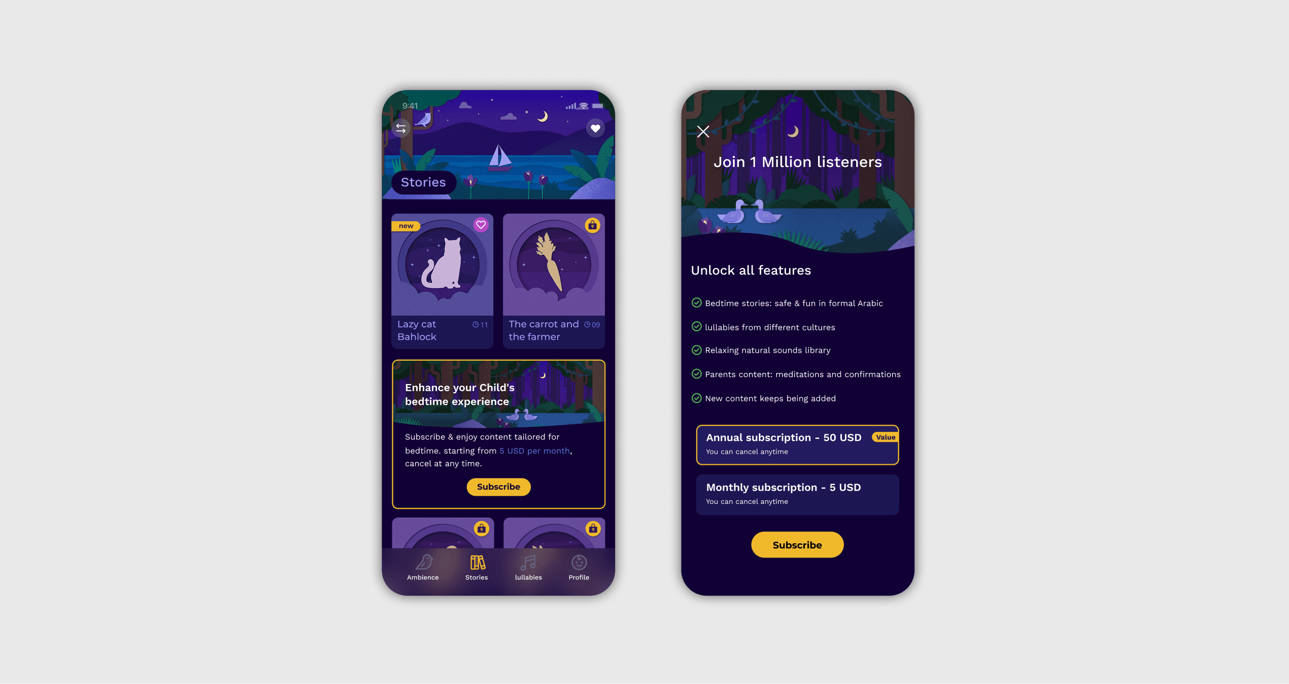
A soft paywall

Rather than a hard wall at launch, the subscription is a soft paywall woven into browsing. Families explore with free content, feeling the value and building trust before any ask.
Paywall detail

Arabic first, localised to English

The app is Arabic at its core, its audience, its classical-Arabic stories, and a right-to-left interface. English is a localised layer added for families who navigate more easily in English, while the audio stays Arabic throughout.

Impact

Success came down to the fundamentals: adoption, engagement, conversion, and retention. Two years after launch, all four have held.

58K

Organic downloads across iOS and Android, with no paid marketing.

4.5%

Download-to-paid within 35 days, more than double the 2.1% average for freemium apps (RevenueCat, 2026).

70%

Of subscribers still paying after their first month, a strong hold for a subscription product.

Monthly recurring revenue, from year one to year two.

It holds 4.8 on the App Store and 4.2 on Google Play across about 200 reviews, and it effectively met the founder's own first goals for reach and paying subscribers, in a niche Arabic-language category.

Reflection

Two years of data settled the debate over the adult section: the one part of the product that strayed from its core is the one part nobody uses, and it is now being sunset. Because I had contained it behind the profile split rather than building it in, removing it disturbed nothing. The lesson I take from the whole project is that protecting the core, and resisting the constant pull to add more, is what kept the product doing its one job well.

The clearest next step is already in motion: as the library grew, families began asking for category-based browsing, the labelling I'd flagged at launch, so I'm now designing the filtering and search built on it. I'm also exploring how to deepen the bond during the story itself, perhaps gentle prompts a parent could use to talk with their child, but only if it can enrich the moment without pulling the child back toward alert.

Lets work together.

Faris Baidoun © 2026

Lets work together.

Faris Baidoun © 2026

Lets work together.

Faris Baidoun © 2026